The Muddy Middle: Inside the Final Color Pass That Decides How Dark TV Gets to Be
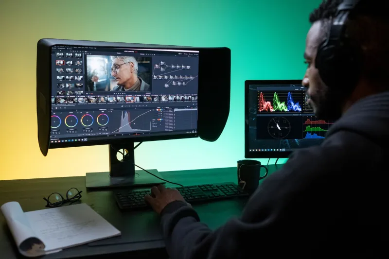
At 9:40 on a Tuesday morning in October, the last version of “Harbor Lights” that anyone will approve is playing on a monitor worth more than most cars. The room is dim. The couch is leather. The coffee is cold. On screen, two characters stand at the end of a dock, a single practical lamp swinging above them, the water behind them doing that expensive black-glass thing that prestige dramas love.
Colorist Mara Ellison is not looking at the water. She is looking at the shadows under the actors’ eyes, the grain in the dark sky, and the spot where the streaming encoder is about to turn a beautiful gradient into a stack of gray squares.
“This is the part nobody sees,” she says. “The director sees the mood. The platform sees the bitrate. I see the collision.”
The Room Where the Night Gets Built
“Harbor Lights” is a fictional eight-episode drama finishing its final pass at a post facility in Burbank. The show has already been shot, cut, mixed, and notes-approved. What remains is the color grade—the last creative pass before delivery—and, in 2026, the last technical argument about how dark a dark scene can actually be.
Ellison has been coloring television for 14 years. She remembers when the reference monitor was the finish line. Now it is the starting line. A final grade has to survive Dolby Vision, HDR10, and SDR conversion. It has to survive a 4K stream on a good TV, a 1080p stream on a hotel set, and a phone screen held at arm’s length on a train with two bars of signal.
“The gap between what I see in here and what someone sees in their living room has never been wider,” Ellison says. “And it’s not because the tools are worse. It’s because there are more living rooms.”
Two Grades, One Episode
The morning pass is the HDR trim. Ellison works with a finishing producer, Dev Shah, who keeps a spreadsheet of delivery specs open on a second monitor. The show’s primary grade is built for a high-dynamic-range reference display. The night dock scene has deep blacks, a warm practical, and a cool moonlit rim. In the suite, it looks like a painting.
Then Shah pulls up the SDR trim. The same scene flattens slightly, the way a shadow does when you turn down the contrast on a TV. Ellison adjusts. She lifts the midtones a hair. She adds a touch of texture in the darkest areas so the encoder has something to hold onto besides a flat block of near-black.
“If you give the compressor a clean gradient, it will find a way to ruin it,” Shah says. “If you give it a little noise, a little grain, it behaves better. It’s counterintuitive. You’re adding imperfection to protect the image.”
That is the compromise colorists describe over and over in 2026: the image that looks best on the reference monitor is not always the image that survives the stream. And the image that survives the stream is not always the image the director approved.
The Phone Is the New Reference Monitor
After lunch, Ellison does what she calls the “phone pass.” She pulls the episode onto a tablet, then a phone, then an older phone she keeps in a drawer specifically because its screen is not great. She dims the brightness. She watches the dock scene in a room with the blinds open.
“You would be surprised how many notes come from this,” she says. “Not from the director. From the reality of the viewer.”
On the older phone, the dock scene is not muddy, exactly. It is worse: it is vague. The water loses its texture. The actors’ faces become soft shapes. The practical lamp blooms into a white smear. Ellison makes a note to pull down the highlight on the lamp and add a subtle fill on the actors’ cheeks.
This is not a new problem. Television has always been graded for the worst screen in the house. But streaming compression has made the worst screen more common—and more unpredictable. A show can look pristine on a 65-inch OLED and lose its shadows on a laptop with a low-bitrate connection. The colorist cannot grade for every device. But in 2026, they are expected to try.
When “Cinematic” Becomes “Muddy”
The creative tension is real. Directors love darkness. It signals seriousness, atmosphere, prestige. But darkness is expensive in data. A night scene with deep blacks and subtle gradients asks the encoder to preserve information in exactly the place where compression is most aggressive.
“I’ve had conversations where a director says, ‘I want it to feel like a memory,’” Ellison says. “And I have to say, ‘On a phone, it’s going to feel like a broken memory.’”
She does not always win. Sometimes the director chooses the darker grade and accepts the risk. Sometimes the platform’s delivery specs force a compromise before the director sees it. Either way, the final pass is a negotiation between what the scene means and what the signal can carry.
Shah calls it “the muddy middle”—the range of shadow detail that survives compression but still feels intentional. “You’re not trying to make it bright,” he says. “You’re trying to make it legible. There’s a difference.”
The Notes That Never Make It to the Screen
By late afternoon, Ellison has a version she likes. The dock scene still feels like night. The water still has texture. The actors’ faces still read. She sends it to the showrunner for a final look.
The showrunner watches on a calibrated monitor in a dark room. He says it looks great. Ellison thanks him and does not mention the older phone in her drawer, or the low-bitrate encode she watched at lunch, or the three tiny adjustments she made to keep the scene from collapsing into blocks.
That is the job in 2026. The colorist is not just shaping color. They are shaping what survives the trip from the suite to the couch. And sometimes the most important note is the one nobody ever sees.